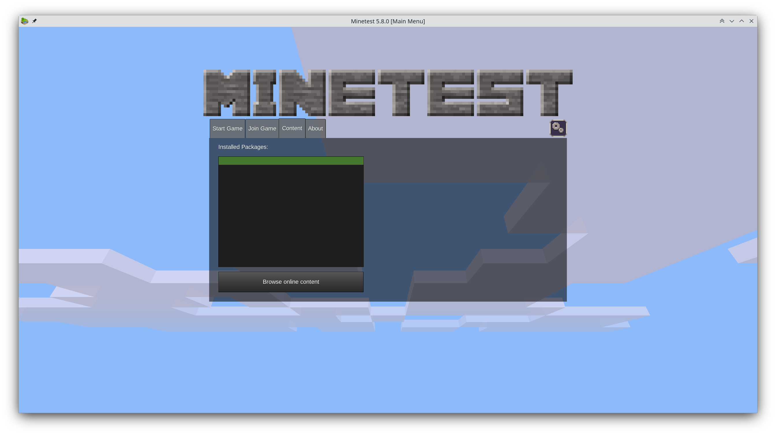
Years have gone by and hundreds of comments have been written about the proposal, but the main screen still looks like this:

What do you guys think is the cause of this stagnation? Too much discussion? Too few people willing to fork it?
I’ve thought about it myself and why I didn’t contribute a new main menu and came to the following conclusion: It requires understanding Minetest’s codebase and the libraries it uses, it requires C++ experience (which I don’t have), and after all that effort there’s zero guarantee that it ever gets used.


I’m a long time heavily modded minecraft player, and I’ve never heard of this issue. If you want proper feedback, I’d suggest adding more context. (That is to say, an outline of the feedback, so we don’t have to wade through 6 years of discussion.)
Minecraft has always had a janky aesthetic, so this doesn’t seem like it’s particularly out of the ordinary.
Wrong game. Minetest, not Minecraft.
Ah, I assumed it was part of some sort of OSS mod suite for minecraft. My mistake.
Hehe, this is about MineTEST, a “clone” of Minecraft. So it’s probably understandable you’ve not heard of the issue. 😏
That explains it! Lol.
I am somewhat of a Warcraft player myself and have played lots of custom maps. I too never heard of this issue.
deleted by creator